Projects / Noir Cambrien Branding
Client / Noir Cambrien
Format / Branding & Identity
I was approached by the Director of this start-up residential development company with the task of branding the business. Their name derives from that of a type of granite found in Canada, it both literally and stylistically reflects the nature of the homes they build. The branding had to emphasise the qualities that were evident in all of
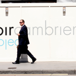
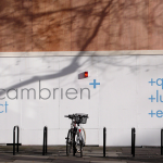
their projects and maintain that level of elegant, modern class the name suggests. I opted for a simple, typographic approach for the logotype, using two, slightly modified and well-spaced weights of Futura, removing the dots off the “i’s” to keep the logo as streamlined as possible. A ‘plus’ icon eludes to the quality of the company’s work and allows an addition of a secondary logotype with the tagline “quality, luxury, elegance”.