Projects / Personal Branding
Client / Personal
Format / Branding
I needed an identity whilst working as a freelance designer. During university I had developed the Pi icon, which derived from my surname, I wanted to push this further and create something that was strong graphically but also said something about me as a designer.
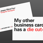
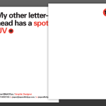
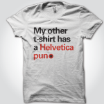
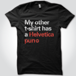
I developed the tagline – “I like negative space, typography, the typeface Univers and the Pantone colour red 032C” – and used the Pi symbol as a stamp of approval to create a simple and bold solution. Not wanting the identity to take itself too seriously, I introduced a series of tongue in cheek statements about design to the printed materials to generate interest and an open dialogue with the recipient.