Projects / Realize Studio
Client / Realize Studio
Format / Branding
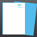
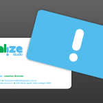
This brand identity was developed for an independent architectural visualisation studio. The concept evolved from the idea that they visualise people’s ideas and bring them to life as a 3D image. The exclamation mark acts as a visual symbol, in reference to the idea of having a realization or new idea.
By incorporating the exclamation mark into the word mark as an upside down ‘i’ there is also a reference to the company turning people’s perceptions on their heads and changing the way the studio’s clients perceive things. The use of a rounded font gives the logo a playful yet modern feel and a palette of two colours has been included – blue and green are both references to nature and as such the link between architecture and the natural environment.